Helping HR admins submit payroll with confidence
Product area
Monthly payroll submission
Role
Product Designer (IC)
Teams
PM, Freelance designer, FE engineer

Problem → Tension
Problem & Context
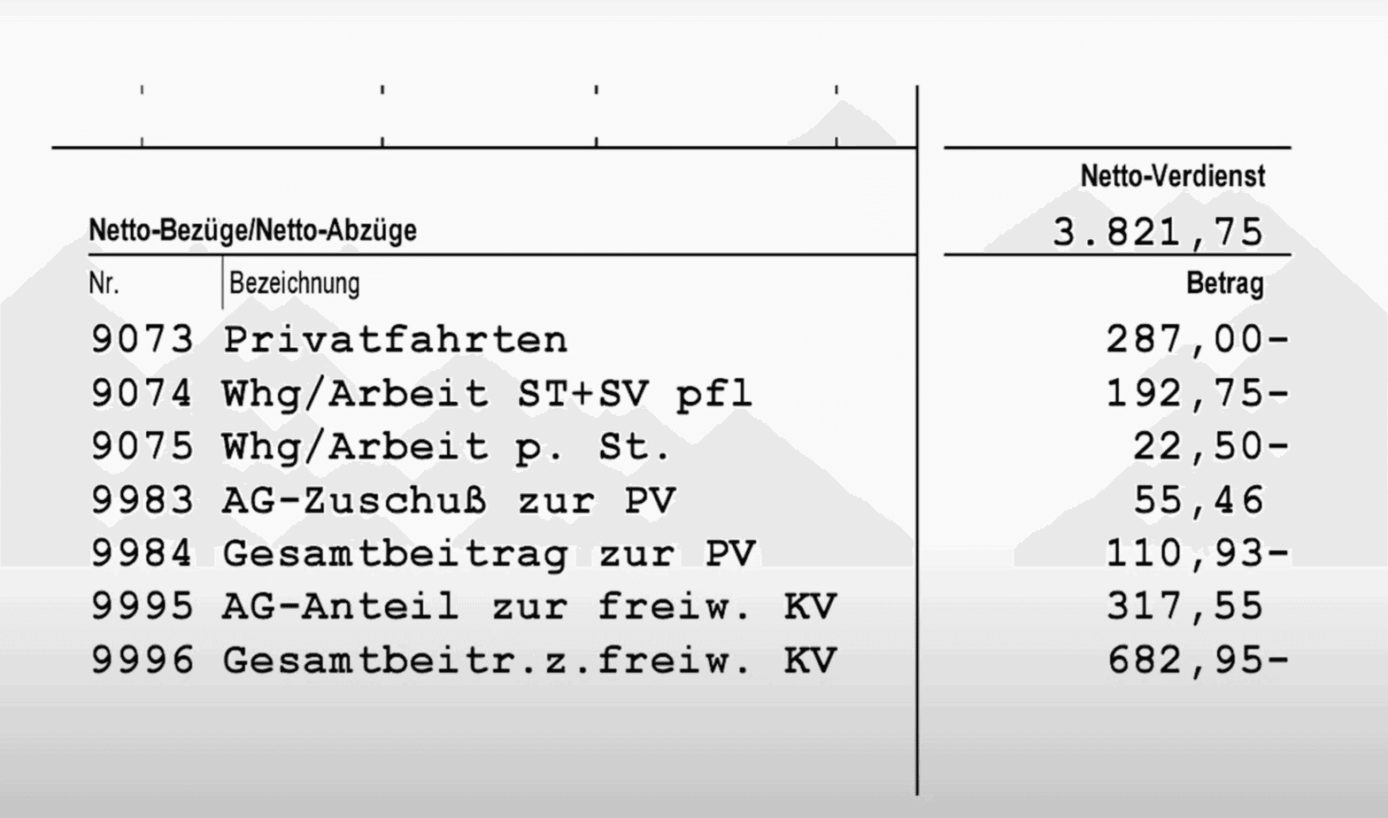
Payroll providers need their SMB clients (HR admins) to finalise monthly payroll in-product. But clients are infrequent users (2-3×/month), forget the workflow, and lack visibility into “what changed” this month. As a result, only a minority of cycles were properly confirmed in the tool; the majority defaulted to email/Excel, creating unstructured work for payroll providers.
Key frictions
No single place to understand what’s expected and what’s left.
No trustworthy overview of changes already made this month.
“Confirmation” felt risky because users couldn’t see the full picture.
Research → From scattered input to structured insight
Lack of clarity — HRs don’t know what needs to be done this month

“So, what do I even need to enter? I have to check my notes and make sure I didn’t forget anything.”
What we learned
- Payroll in smaller companies is outsourced; HRs aren’t trained in payroll specifics and often see it as “not their job.”
- They rely on personal, handwritten checklists to avoid mistakes.
- When submitting payroll data, they aren’t sure what exactly needs to be reviewed or added.
How might we…
- Help HRs understand what’s required for this payroll cycle without having to rely on memory or paper notes?
- Surface the tasks that matter now, so HRs can focus on what needs attention rather than guessing?
- Build confidence by turning “I hope it’s done” into “I can see it’s done”?
No trustworthy overview — HRs can’t see what’s already entered or pending

“I know there were some changes — but did I already enter them? Or do I still need to?”
What we learned
- HRs log in only a few times per month and don’t want to relearn the system each time.
- Several HR admins can edit or add information, which makes it unclear who has already entered what. As a result, no one has full confidence in which updates are reflected in the system.
How might we…
- Make the system transparent for HRs, showing what’s already added and what’s still open?
- Provide a single view of “current state”, so both HRs and specialists operate from the same source of truth?
Confirmation anxiety — HRs don’t trust what happens after clicking
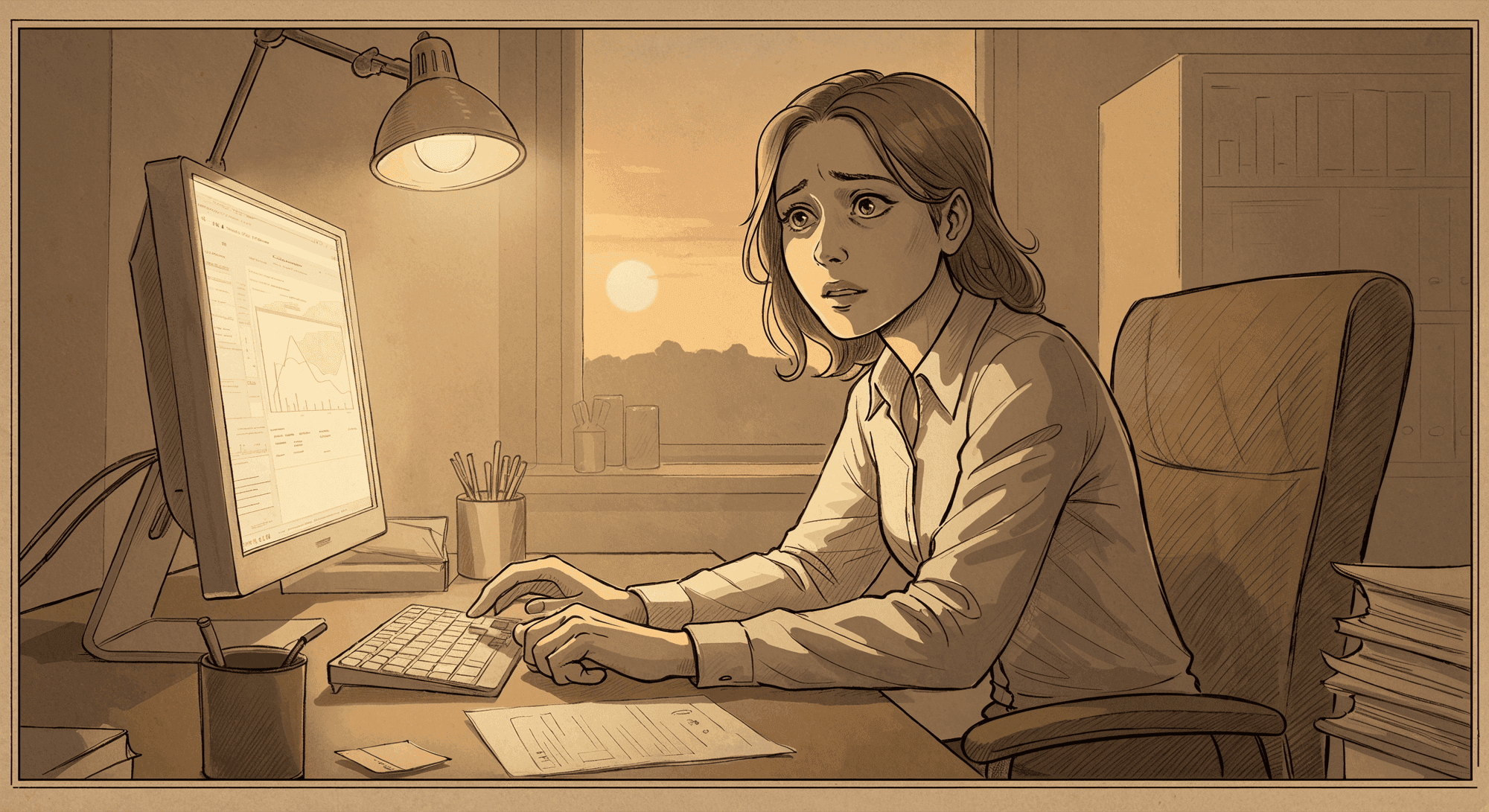
“When I press Confirm, I’m not sure if everything’s correct or if something’s missing.”
What we learned
- HRs see confirmation as risky because they can’t preview what’s being sent.
- Many click Submit and then email the specialist saying, “I’ve confirmed everything — please check if it’s right.”
- The final step is less about completion and more about seeking reassurance.
How might we…
- Turn confirmation into a moment of reassurance, not uncertainty?
- Clearly show what’s being sent and what will happen next, so HRs can trust the outcome?
- Replace follow-up emails with visible confidence inside the product?
How we moved from assumptions to design execution
Where we started
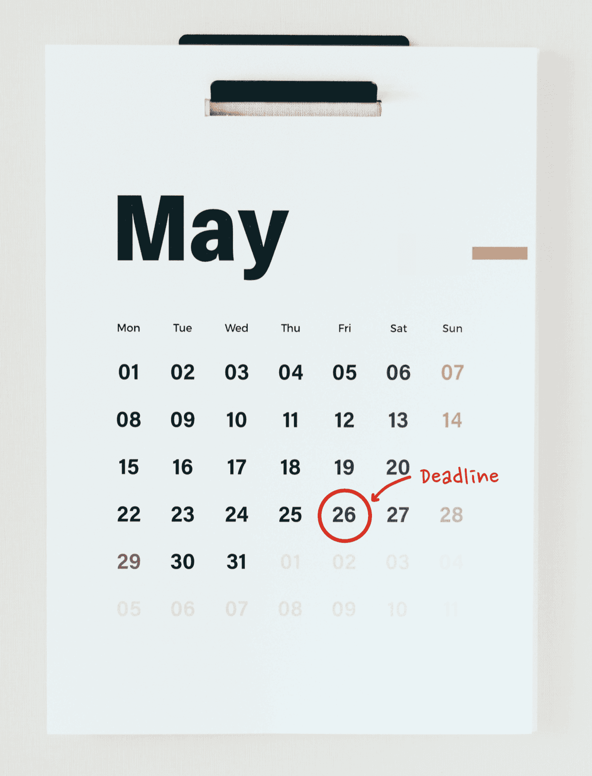
Our first idea was to visualise the payroll process and put strong emphasis on the deadline. We assumed that if HRs saw the current payroll period, days left until the deadline, and which stage they were in — they would know what to do next and act earlier.
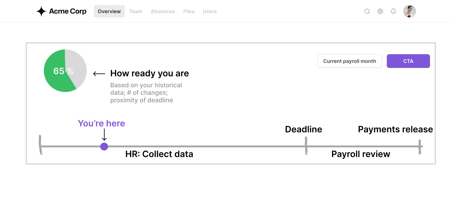
1. Deadlines didn’t influence behaviour
The assumption was that deadlines would motivate action — but in reality:
- Even if HR admins miss the deadline, payroll providers ultimately complete the payroll run inside their own workflow → instead of HRs.
- HRs know this, so the deadline becomes a soft suggestion, not a trigger for action.
So instead of reducing uncertainty, the deadline added pressure without providing clarity.
2. Multiple HR admins → no shared sense of progress
Around 35% of companies registered in our system often have more than 1 HR admin making changes:
- one adds joiners,
- another logs absences,
- another uploads documents.
Because everyone works in fragments and logs in infrequently, they often ask themselves: “Did my colleague already add this?” “Are we done or not?”
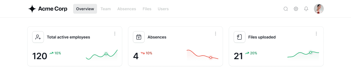
The moment HRs see the numbers, they automatically compare them to their own knowledge. We surfaced the three signals that HRs naturally use to sanity-check the month:
1. Employees
Total active employees (with change) → helps verify joiners/leavers.
2. Absences
Absence requests + pending approvals → highlights forgotten entries.
3. Documents
Files uploaded by employees → reveals missing documents.
This gives HR admins a clear starting point that is instantly understandable, even if they log in once a month.
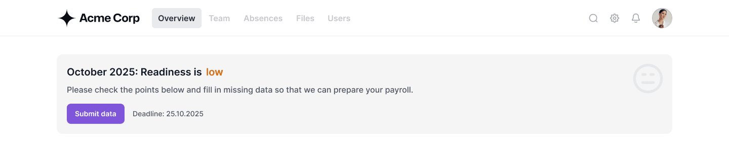
HR admins needed one answer: “Did I finish everything?” So we explored simple ways to show readiness. Whatever we chose had to be fast to build and work reliably across many companies.
A percentage score
Too granular. It suggests precision we couldn’t guarantee and adds cognitive load HRs don’t need.
Three states (low, medium, high)
“Medium” created confusion rather than clarity — nobody would guess what medium means. It also risked over-engineering something AI can handle in the future.
Two clear states (low or high)
The simplest and most intuitive. It directly answers the only question HRs actually have: “Am I ready?”
Lastly, the confirmation step
The first issue was the confirmation modal itself — it didn’t explain what happens next. It felt like a one-time click with no sense of progress or follow-through.
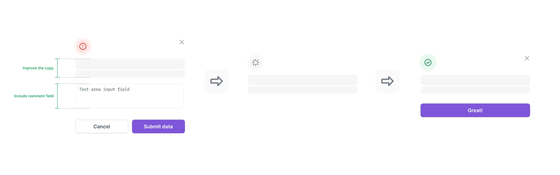
Instead, we needed to →
1. Show a clear “what happens next”
HRs wanted transparency. If they close the month, they should immediately understand what the system will do next.
2. Let HRs leave context for specialists
They often send a separate email after clicking “Submit.” A comment field reduces that extra step.
3. Make confirmation feel like progress
HRs told us they needed a sense of accomplishment — not just a static table.
A final review that feels guided, not overwhelming
To reduce last-minute uncertainty, we introduced a simple, step-by-step review at the end of the month. Instead of scrolling through long tables, HRs are asked one clear question at a time:
- “No new contracts and team members starting this month?”
- “1 contract ending this month. All complete?”
- “2 absences tracked. All complete?”
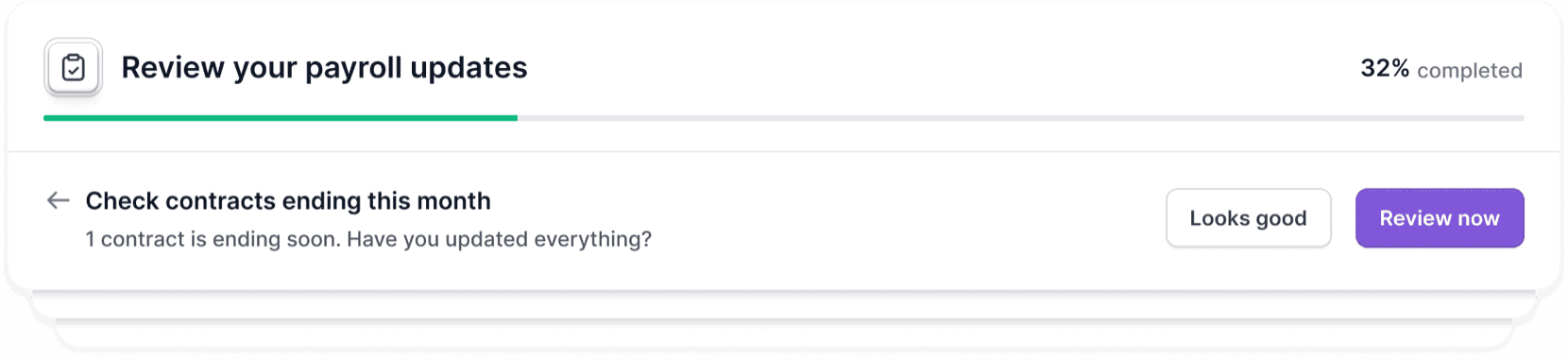
This quiz-like flow does two things HRs repeatedly asked for: it creates confidence by helping them mentally confirm each area, and it provides a sense of accomplishment — every closed step feels like progress.
Adoption → Behaviour change we observed
Quantitative signals
More HR engagement within the tool
We saw a noticeable increase in HRs making employee changes directly in the tool, showing a shift away from email.
Active contextual communication
HRs increasingly use in-app comments to leave notes for payroll specialists — replacing long email threads. These comments revealed several areas for further improvement.
Stable validation rate
HR confirmation rates stayed steady during the transition, suggesting new patterns are forming without disruption.
Qualitative feedback
Several HR admins said the new overview helps them see what’s done and what’s pending — “finally something that makes payroll feel under control.”